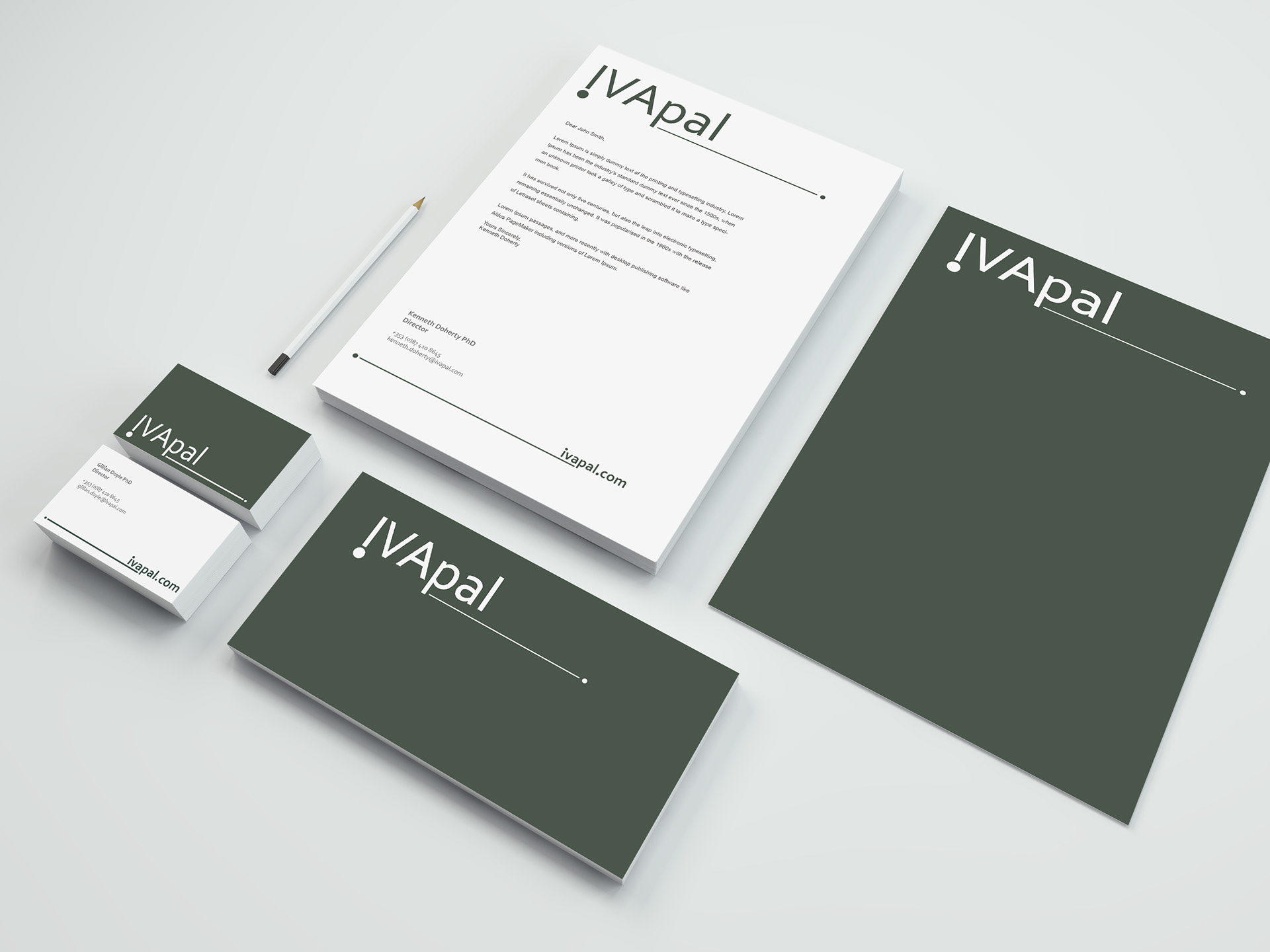
Stationery Set
This was a group project as part of our Inovation and Creativity module. IVAPAL is an insolvency company, the Co - Founders and Directors of the company are Kenneth Doherty and Gillian Doyle. BRIEF They already had a name – IVAPAL, which was open to suggestions, but that we agreed sounded good. The brief was to design for them a new logo and branding that would showcase who they are as company and make them stand out against their competitors. SOLUTION There was a few designs put forward, however they preferred this design as their corporate styling, which happened to be the one I had designed. When pronouncing the name of the company IVAPAL, I began to hear ‘I have a pal’ meaning friend. This lead me to want to create a friendly yet statement logo for them. I turned the ‘i’ upside down, so that an exclamation mark was made, while also representing ‘I’ giving a client a voice, “I have a friend in IVAPAL. The choose green and an off-white to show that the company was fresh and modern. I associate the colour green with money and that is what the company is going to help you with, your money worries so I thought this would give a trusting and loyal look to the brand while also helping to make it look different to its competition.